Online shoppers judge a firearms retailer in seconds. When menus feel confusing, buyers bounce, then they purchase from a rival that makes the next step obvious. Strong navigation turns a catalogue into a guided path, so customers reach the product page that fits their need, budget, and urgency.
This guide focuses on gun store navigation that supports real sales, not web jargon. It covers category structure, filters, search, and mobile menus in a way owners can brief to staff, developers, and vendors.
Why Navigation Drives Revenue
A firearms site often carries thousands of items, plus compliance steps that add friction. Customers arrive with specific intent, such as a calibre, a platform, a brand, or a purpose like home defence. If the menu forces guessing, shoppers leave before they even see stock.
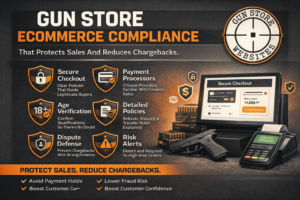
A second pressure comes from trust. People want clarity on shipping rules, transfer steps, and support. Clear pathways lower calls, reduce cart abandonment, and protect your reputation.
Here are the business reasons navigation deserves board-level attention.
Buyers Arrive With High Intent
Search traffic tends to land deep in the site, not on the home page. A visitor who lands on a product page still needs fast routes to accessories, compatible magazines, optics, and ammunition. Navigation that connects those paths increases average order value without aggressive upsells.
Staff Time Costs Real Money
When the site answers common questions, the counter team spends less time on routine calls. A clean structure can route people to transfer info, hours, and range details in two clicks. That frees staff for in-store service, which supports loyalty.
Messy Menus Damage Perception
A cluttered header reads like a discount directory, not a specialist retailer. Shoppers associate order with professionalism, which matters for higher-ticket firearms and premium optics. A tidy menu makes the store feel established, even for a newer FFL.
Category Structure That Matches How People Shop
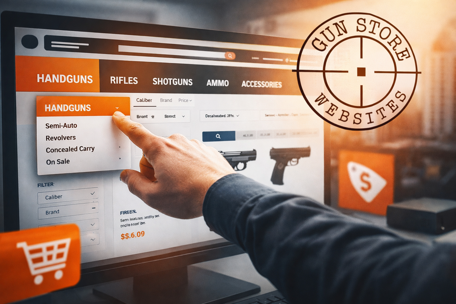
Most gun sites start with supplier categories, then wonder why conversions lag. Buyers think in use cases and platforms, not warehouse codes. A structure that mirrors customer language helps shoppers self-select, then narrows options fast.
The following are the building blocks of a category tree that supports sales.
Keep Top-Level Choices Few
Limit the main menu to the categories that drive most revenue. Firearms, ammunition, optics, parts, magazines, and gear often cover the core. Extra items can sit under a single “More” bucket so the header stays calm.
Group By Intent, Not Just Brand
Subcategories should match the questions customers ask at the counter. Examples include concealed carry, hunting, range training, and home defence. Brand pages still matter, yet they work best as filters and internal links rather than the primary navigation spine.
Give Transfers And Compliance A Home
A visible “Transfers” path reduces confusion for buyers who ship to your store. Keep the page plain and direct, with steps, fees, and contact options. That content supports confidence, even for first-time purchasers.
Connect Content To Commerce
Education builds trust, then it drives product discovery. Link buyer guides and FAQs from relevant categories, not from a vague blog tab. One strong guide can funnel readers to a curated set of products without feeling pushy.
A site that pairs navigation with content gains traction in organic channels. For deeper growth, connect that work to your broader search engine optimization plan so pages map to real queries and buyer intent.
Filters And Search That Stop Dead Ends
A good category tree gets shoppers close. Filters and search finish the job. The goal stays simple, shoppers should reach a short list of in-stock options without frustration.
These are the filters that carry the most weight on firearm retail sites.
- In-stock toggle: Shoppers want what they can buy now. A clear stock-only view cuts rage clicks and reduces support tickets.
- Platform and fit: Buyers need compatibility with what they own. Clear options for Glock, AR-15, AK, 1911, and common rifle actions keep the path smooth.
- Calibre and gauge: Ammunition shoppers rarely browse for fun. A tight calibre selector speeds the journey, then it reduces returns.
- Price range: Many customers enter with a ceiling in mind. A simple slider keeps them engaged without forcing page reloads.
- Purpose tags: Some buyers shop for an outcome, not a spec. Labels like hunting, duty, range, and home protection help new owners pick faster.
- Compliance notes: Rules vary by state and product type. A short notice that flags restrictions sets expectations early and prevents checkout surprises.
Search deserves equal attention. Autosuggest can show categories, brands, and top products, which helps people who spell models wrong. Search results need sorting too, with options for relevance, price, and newest arrivals.
Treat search logs like a free focus group. When buyers type “19 11” or “glock 43x,” map those terms to the right products and categories. Add common nicknames, abbreviations, and calibre formats so results stay accurate. A small set of synonyms can lift revenue fast.
Mobile Menus That Keep Buyers Moving
Mobile traffic dominates for many retailers. Customers browse during breaks, in cars, and on the couch. A menu that feels fine on desktop can fail on a phone, so the mobile experience needs its own design rules.
Here are the core mobile patterns that keep buyers on track.
Use A Sticky Header With Restraint
A fixed header helps shoppers return to search, cart, and menu at any time. Keep it slim so product photos and key details stay visible. A crowded bar steals attention from the offer.
Build Short Paths To High-Value Pages
Mobile users hate deep drill-down menus. Add quick links for best sellers, new arrivals, and top categories within the first tap. That reduces effort, then it lifts conversion.
Make Product Pages Easy To Use
Breadcrumbs help users step back without losing context. Simple tabs for description, shipping, and returns prevent endless scrolling. A “related items” block can point to ammo, mags, and accessories that match the firearm.
Keep The Checkout Path Obvious
Cart icons should show count and stay visible. The checkout button needs strong contrast and a clear label. Clear progress steps reduce anxiety, which helps completion.
Conclusion
Gun store navigation acts like a quiet salesperson. It guides shoppers to the right category, narrows the list with filters, and keeps the path clean on mobile. A store that treats navigation as a revenue system earns more sales from the same traffic, plus it reduces staff load and customer frustration.
Start with a simple menu, then add high-impact filters and a search experience that respects intent. Small changes in structure can produce outsized gains, especially on sites with large catalogues and frequent stock shifts.